Continuing the theoretical request from the last blog, imagine your manager asked you to look into the overall sales and profitability for the company and to identify key areas for improvement. You have a bunch of data loaded into Tableau and you’ve set out to identify key areas for improvement, but you aren’t sure where to start.
Create a view.
With four years worth of data, you decide to drill into the overall sales data between 2014 and 2017 to see what you find. Start by creating a simple chart.
1. From Measures, drag Sales to the Rows shelf.
2. From Dimensions in the Data pane, drag Order Date to the Columns shelf.
Note: When you drag Order Date to the columns shelf, Tableau creates a column for each year in your data set. Under each column is an ABC indicator. This indicates that you can drag text or numerical data here, like what you might see in an Excel spreadsheet. If you were to drag Sales to this area, Tableau creates a crosstab (like a spreadsheet) and displays the sales totals for each year.
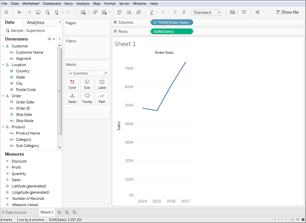
Tableau generates the following chart with sales rolled up as a sum (aggregated). You can see total aggregated sales for each year by order date.

This line chart shows that sales look pretty good and seem to be increasing over time. This is good information, but it doesn't really tell you much about which products have the strongest sales and if there are some products that might be performing better than others. Since you just got started, you decide to explore further and see what else you can find out.
Refine your view
To gain more insight into which products drive overall sales, try adding more data. Start by adding the product categories to look at sales totals in a different way.
From Dimensions, drag Category to the Columns shelf and place it to the right of YEAR(Order Date).
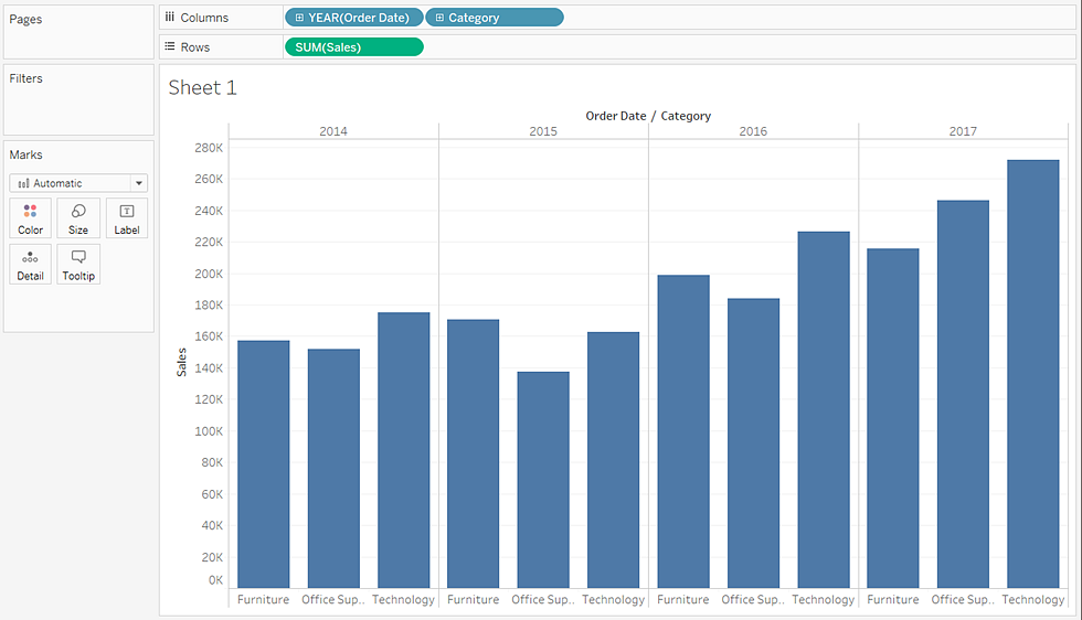
Your view updates to a bar chart. By adding a second discrete dimension to the view you can categorize your data into discrete chunks instead of looking at your data continuously over time. This creates a bar chart and shows you overall sales for each product category by year.

Your view is doing a great job showing sales by category—furniture, office supplies, and technology. An interesting insight is revealed!
From this view, you can see that sales for furniture is growing faster than sales for office supplies, even though Office Supplies had a good year in 2017. Perhaps you can recommend that your company focus sales efforts on furniture instead of office supplies? Your company sells a lot of different products in those categories, so you'll need more information before you can make a recommendation.
To help answer that question, you decide to look at products by sub-category to see which items are big sellers. For example, for the Furniture category, you want to see details about bookcases, chairs, furnishings, and tables. Looking at this data might help you gain insights into sales and overall profitability, so add sub-categories to your bar chart.
Double-click or drag the Sub-Category dimension to the Columns shelf.
Note: You can drag and drop or double-click a field to add it to the view but be careful. Tableau makes assumptions about where to add that data and it might not be placed where you expect. You can always click Undo to remove the field or drag it off the area where Tableau placed it to start over.
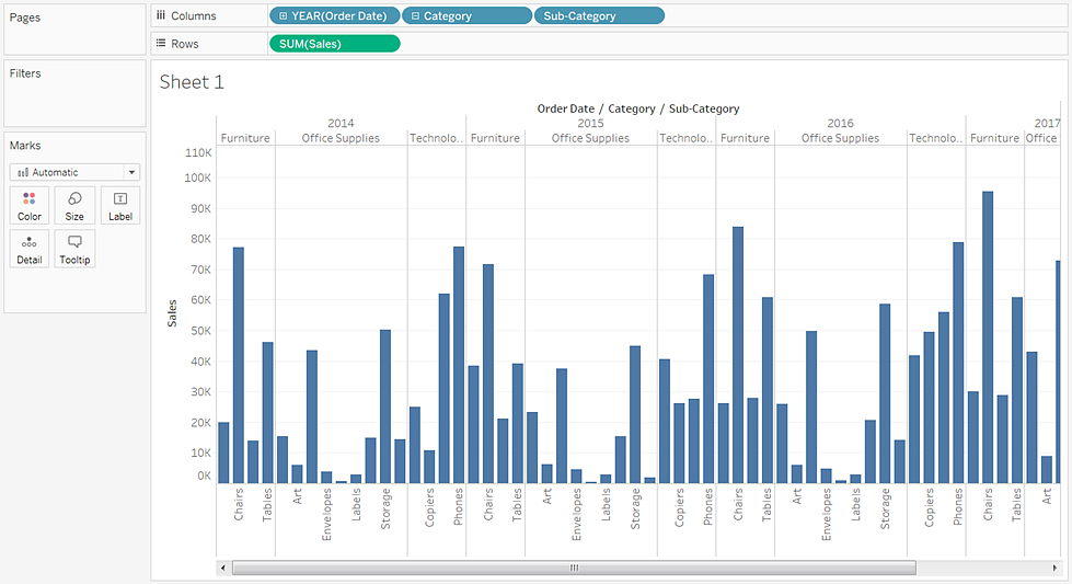
Sub-Category is another discrete field. It creates another header at the bottom of the view and shows a bar for each sub-category (68 marks) broken down by category and year.

Now you are getting somewhere, but this is a lot of data to visually sort through. In the next section you will learn how you can add color, filters, and more to focus on specific results.
This step was all about getting to know your data and starting to ask questions about your data to gain insights. You learned how to:
- Create a chart in a view that works for you.
- Add fields to get the right level of detail in your view.
Now you are ready to begin focusing on your results to identify more specific areas of concern. In the next blog, you'll learn how to use filters and colors to help you explore your data visually.
If you agree that it’s time to stop making decisions based on poor quality data or the opinions of a few, and start making fact-based decisions supported by hard data, get in touch with Onebridge today using the link below. You can also join us in a conversation on Twitter, Facebook or LinkedIn.


